Since the summer of 2022 until a few weeks ago, our campus was noticeably incomplete without its key structure: the Tower Building which was being renovated. In addition to accommodating important staff such as the administrative, nurse and attendance team, the building has always been a symbol of the school, displayed on the website and throughout the internet when “Paly” is searched.
Some of the main changes to the building include a large outdoor patio adjacent to the quad, a redesigned interior and a more modern finish in the original halls. I wanted to see this all for myself, and then give you an unbiased review of the renovated Tower Building on the basis of its aesthetics, facilities and quality.
With its Spanish colonial architecture, the building stays in theme with the rest of campus The exterior was minimally changed. When I first walked into the building, two things stuck out: the smell of fresh paint lingering in the air and the lack of dust settling on the cabinets and the floor. Not only do the walls look much cleaner than before, but the main hall, now much more roomy, provides visitors with a less crowded feeling than before.
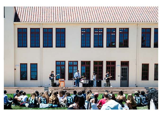
The brightened white walls also give the main hall the vibrance and energy it lacked before the renovation. Unlike the previously crusty and damp interior, the building – while retaining its vintage touch – now has a modern feel to it. Additionally, the new patio connecting the Quad to the office building is an amazing addition because it offers up a new and improved stage to host events and live performances.
Walking through the main hallway, I peeked into many rooms and noticed improvements, especially in the layout of the attendance office. Just off of the new patio, the attendance office has a modern interior due to its bright color palette and modern appliances.
A long curved desk greeted me when I walked in, and a TV sat on the wall. The spacious room also holds a reception area for students to wait if there is a line – a complete 180-degree transformation from the cramped, old office.
New water fountains have also been installed in the hall of the building. Though I enjoy modern water fountain technology as much as the next person, the sensors on the machine are over the top. At a certain point, clicking a button is barely more effort than scanning your hand over a sensor the whole time.
The new Wellness Center, which is currently the temporary InFocus News recording studio, is a disappointment, though. Instead of the modern style of the attendance office, the room retains the original old, gothic vibe despite the opportunity to revamp the area with a set of vibrant colors.
Overall, the building has had a net positive in its upgrades, and the facilities are truly state of the art. Though there are some minor downsides, the overwhelming majority of the design work and changes have been elite to say the least. Not only was the building able to maintain its classic touch on the exterior, but it also goa new and more modern interior. I think that the clear effort on the part of those who helped bring this about deserves a 9.9 out of 10.


