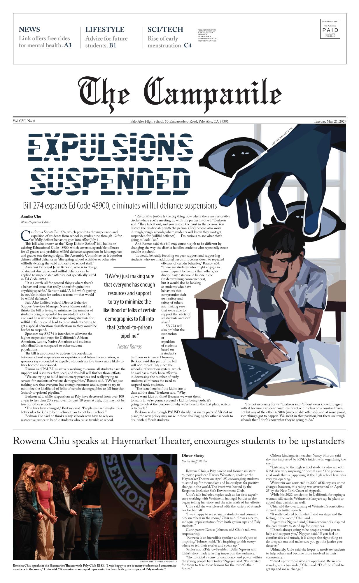
In today’s culture, a title in a rainbow Comic Sans font immediately sparks a connection to memes in the minds of nearly every Paly student. It repels some and inspires others, but oozes memey-ness all around.
Fonts and colors both spark nuances in perception, unconsciously conveying various themes that are constantly utilized through both website design and marketing.
According to Andrew J. Elliot, a professor of psychology at the University of Rochester, design aesthetics extend beyond simply “looking good,” proving to be ubiquitous perceptual stimuli that link to psychological functioning. They are crucial to the affiliation and attraction of context and are the cornerstone of consumer evaluation and consumption, impacting people’s cognition and behavior.
Even the seemingly-inconsequential act of glancing at a certain font can involuntarily stir up a mixture of powerful emotions and connections. According to a survey consisting of 50 Paly students, most agree that red is often associated with boldness or love, and blue with trustworthiness or sadness. Times New Roman is considered formal, while Arial is viewed as boring.
This phenomenon occurs due to a psychological theory known as the Gestalt principles of design, which states that the brain tends not to focus on the individual pieces of a design, such as specific colors and fonts, but rather applies a universal understanding based on previous experiences and knowledge to its entirety.
In other words, it is “looking at the whole rather than just the parts,” said Brett Griffith, Video Production and Graphic Design teacher. “We see and arrange things. It’s just something we as people do. We look for patterns and infer based on them. It’s stuff you see all the time, but you may not always be aware of.”
According to Nick Kolenda, a researcher in consumer psychology and the author of Methods of Persuasion, to form a collective evaluation, the brain undergoes rapid parallel processing that connects attention to emotion and neuroscience to behavior through the following steps.
First, you see fonts and colors. Let’s take Comic Sans in rainbow, for example.
The brain then forms perceptual associations by disentangling the visual characteristics of the font and color, from thin and loose to dark and opaque: Comic Sans appears rounded, and rainbow is eye-catching.
Third, direct associations and comparisons are made between perceptual associations and the real world through the semantic and emotional networks: both Comic Sans and rainbow appear childish.
Next, perceptual and direct associations are combined to form a collective meaning based on context from previous experience: eye-catching and childish descriptions evoke thoughts about memes.
Last but not least, the emotions that are sparked are misattributed to the object or product that the fonts and color are referring to: rainbow Comic Sans is now associated with memes.
Website designers are experts at harnessing parallel processing and utilizing both color and font psychology to cater to a specific audience. From creating eye-catching red buttons to discovering the perfect headline font, they recognize the importance of each of these miniscule, but undeniably persuasive details that are crucial to impacting any audience.
“Color and font theory and their emotional cues produce certain effects on an audience. They affect us in an instant — it’s about perceptions. For example, really saturated and extremely vibrant colors are going to excite and compel audiences.”
Brett Griffith
Paly sophomore Olivia Chang has firsthand experience with utilizing fonts and colors in the web design world. She is the designer and coder of a variety of sites and apps, including Readlio, an online reading log, Mere, a daily journal app and studyguides.science, a database of biology and chemistry notes — all of which serve their unique audiences through the power of color and font psychology.
“Colors are a big part of web design,” Chang said. “They’re used when you want to emphasize certain elements so that users click where you want them to. For example, a bright red ‘Sign Up’ button works much better than a gray underlined link. Various colors subconsciously evoke various moods, so depending on the design that you’re going for, color is a big factor in being able to convey a certain aesthetic.”
Over time, web designers have adopted similar color schemes and trends, developing a standard format that can be customized to fit certain marketing themes.
“Light or dark blue, purple and green are pretty popular,” Chang said. “The colors used are almost always either muted or dark — monochromatic if you’re going for a minimalistic look.”
Font choice is one of Chang’s favorite aspects of web design as well, especially the aesthetic orchestration of various font pairings.
“You can have a great user interface design, but use some generic font and it’ll ruin the whole thing. Some fonts are a pretty quick turn off for users, for example, Papyrus, Times New Roman and Comic Sans. Others fit really nicely into the style that you’re going for, [like] Proxima Nova, Avenir [and] DIN Next [for] a tech startup.”
Olivia Chang
Griffith also said using specific fonts to convey certain messages is essential.
“Type is everything,” Griffith said. “Type decisions are probably the hardest, but most people overlook that.”
Colors and fonts add pizzazz to basic components of sites, such as text links, navigation, buttons, headings and list items, prompting their specific audience to click on certain items.
They also play a big role in the readability of all websites and apps, which is a key factor considering that they are designed for fast consumption.
“Fonts and colors are integral to the readability of website content. The wrong font and color combinations make it impossible to read — think red Comic Sans on a rainbow gradient background and you get the idea.”
Olivia Chang
Colors and fonts are also instrumental in persuading people to purchase advertised products or services that the site provides.
According to content marketer Margaret Kelsey, marketing creates interest and design the method of communication. Publicity and views often directly correspond with the design aesthetics of a site.
In matching colors and fonts to the context of certain products, consumption fluency increases. They attract online customers at first glance before even delving into the specifics of the products offered. Conversely, if the colors and fonts are unrelated to what is being marketed, audiences will lose interest.
Though often underestimated, the influence of fonts and colors is incredibly powerful. Whether it is for web design, an entrepreneurial pitch or even a simple class presentation, keep the fonts and colors used in mind. They may just as well make or break it.